How to Build a Fall Patio Color Palette Without Reaching for Orange
The landscape already brings the warm half of a fall palette for free. Here's the method for building the cool, textured half yourself -- deep green, oxblood, bark, and stone, with almost no orange in the mix.
I said it once, almost as a throwaway line in another post: skip orange, because autumn outdoors is already orange, for free. A few readers wrote in asking what that actually means once you're standing in the aisle at the garden center with a cart half full of gourds. Fair question. It deserves more than one sentence.
This is the method behind it. Not a list of pretty things to buy in rust and amber, but the actual logic for why a patio with almost no orange in it can read as more autumn than one that's covered in it. Short version: the landscape already brought the warm half of the palette, whether you decorated for it or not. Your job is everything else -- the cool end, the neutral end, and the texture that makes the whole thing hold together.
The Landscape Already Brought the Orange, So Don't Buy It Twice
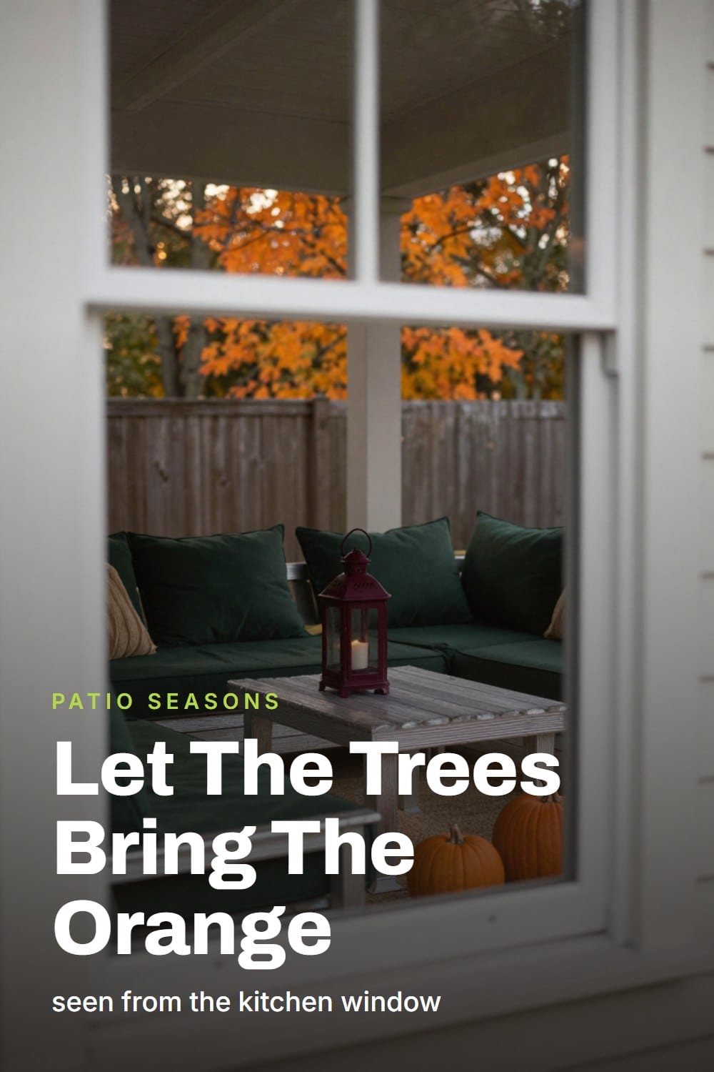
Look past your own furniture for a second, at the actual view past the railing. Turning leaves. Low gold light for weeks on end. A neighbor's maple doing more color work in a single week than a whole seasonal display could manage in a month. That warmth is already there, free, all day, whether or not a single pumpkin has shown up on your steps.
Which means an orange cushion, a string of amber lights, and a rust-colored welcome mat are all competing with something the sky is already doing better. Add more warm and you don't add more fall -- you dilute it. Two warm things end up fighting for the same attention instead of one of them winning outright.
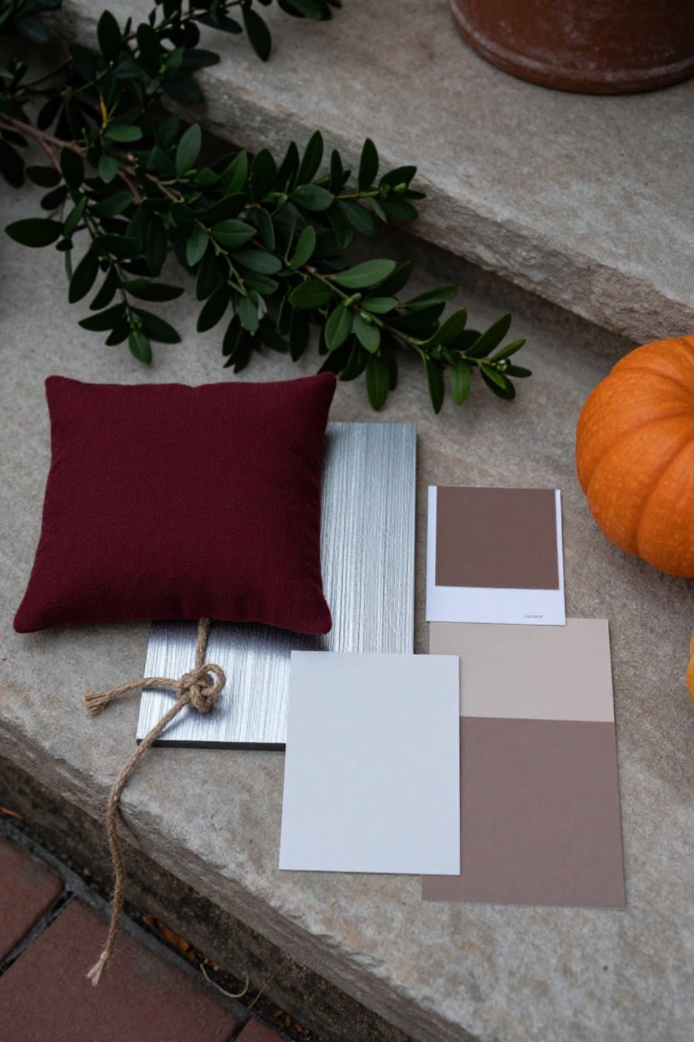
The real opportunity is the other half of the palette: deep green, oxblood, bark brown, stone, oatmeal, unbleached linen. It's the half nobody shops for in October, because none of it says 'fall' on the shelf tag. That's exactly why it works. It's the half that has to come from you, and it's the half that makes the color outside your door look intentional instead of accidental.
Start With the Neutral You Already Own
TeakSilvers evenly within about a year -- the whole palette gets built around that grey, not the honey color it started as.here's what actually happens →that's the whole story
Left alone, teak turns a soft silver-grey within a year — evenly, if it gets even light. This is oxidation of the surface only; the wood beneath is unchanged and its natural oils keep it from rotting. Oil it if you want the honey colour back, and understand you are then committed to oiling it every spring. Grade A (heartwood, tight grain, no knots) silvers evenly; lower grades go blotchy. Nothing about the greying shortens its life.
Upkeep: One afternoon a year, at most. None, if you like grey.
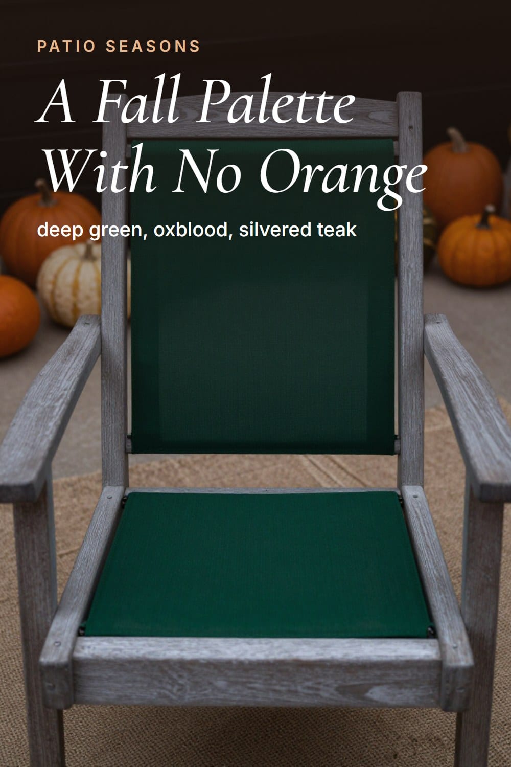
Every palette needs one neutral heavy enough to hold the rest of it in place, and most patios already have theirs sitting in plain sight: silvered teak.
Teak isn't brown. Left alone, it weathers to a soft, even grey inside a year, and that grey is the anchor most people spend every autumn fighting instead of using. Stop fighting it. A grey anchor is exactly what a palette built from deep hue and heavy texture needs underneath it.
If yours hasn't silvered yet, or you're shopping for a piece that will, the materials library's teak page walks through the timeline, and what separates the boards that silver evenly from the ones that go blotchy.
Add One Deep Hue, and Stop There
Once the anchor is set, add exactly one saturated color. Oxblood is doing the most work in outdoor goods this year -- a deep, wine-adjacent red-brown that reads as autumn without reading as a jack-o'-lantern. Deep olive is the other strong option, and both are showing up on surfaces that used to default to cool grey or navy: cushions, glazed ceramic, even powder coating.
One deep hue is a palette. Two competing deep hues is an argument. Pick oxblood or deep olive, not both, and let it land in one or two spots -- a cushion, a lantern, a single glazed pot -- rather than smeared across everything on the porch. A solution-dyed acrylic cushion in oxblood is worth the small premium here: the color runs all the way through the fiber, so it holds its saturation across seasons instead of fading toward pink.
Texture Carries Autumn Better Than Color Does
If you take only one idea from this, take this one: texture reads as fall faster than hue does. A patio built from flat, smooth, single-tone materials looks like summer no matter what color it's painted. Add coarse plaster, open weave, a gritty glaze, real wool, and it reads as autumn in colors you were already using in June.
Layering texture is how you build what I think of as the quiet zone -- a corner of the porch where nothing is shouting, but everything has enough grain and weight that your eye wants to stay there. A jute-look open weave under a wool throw over a bark-textured ceramic pot does more seasonal work than three new orange objects ever will.
Rope weaveStiffens a little in cold, damp weather and softens again in spring -- that's the rope, not rot. The real check is the crossing points where it meets the frame.here's what actually happens →that's the whole story
The olefin and polyester ropes used on good outdoor seating are UV-stable and will not rot. They do stiffen when cold and damp, and a rope chair left out through a wet winter feels like a different chair in March — it softens again as the weather turns. Real deterioration shows as fuzzing at the points where the rope crosses the frame. That is abrasion, not weather, and it is the thing to inspect.
Upkeep: Nothing, most years. Look at the crossing points each spring.
A polypropylene rug is worth a specific mention here, because it does something almost nobody accounts for: the exact rug that looked cool and flat under July's high sun reads noticeably warmer once the light goes low and gold in October. You're not buying a different rug for fall. You're getting a different rug for free, from the one you already own, because the light changed.
PolypropyleneTakes rain and a hose without complaint -- just lift it after heavy weather so moisture doesn't sit trapped underneath.here's what actually happens →that's the whole story
A flatweave polypropylene rug is the most forgiving thing on a patio: it takes rain, it takes a hose, and jewel tones hold their depth for years. The failure is not the rug, it is what happens beneath it. A rug left wet under a table traps moisture against stone or decking and leaves a ghost of itself in mildew. Lift it, let both sides dry, put it back.
Upkeep: Ten minutes after heavy rain. Lift it, do not just sweep it.
Where Powder-Coated Steel and Cast Aluminium Diverge in Fall Light
Both metals get sold in the same deep autumn colorways this year. They don't wear those colors the same way once the light turns low and gold.
| Powder-coated steel | Cast aluminium | |
|---|---|---|
| Perceived weight in a photograph | Reads heavier and more graphic -- a strong anchor for a composed shot | Reads lighter and slightly silvery, even in the same dark colorway |
| A dark finish in low autumn sun | Holds its saturation into near-black at dusk | Picks up more ambient light and looks a shade paler than the paint chip promised |
| How the color actually fails | The coating stays put until it fails at a weld or a scratch -- then it's rust, not color loss | The finish chalks in strong sun, quietly lightening the color over a few seasons, with no rust involved |
| How it ages into the palette | Ages toward matte and slightly rougher, which reads as more appropriate to autumn over time | Ages toward a soft, powdery version of its original color, still smooth to the touch |
The verdict: If you want a deep autumn color to read as a graphic anchor at dusk, choose the steel and touch up the welds once a year. If you want that same color with no rust risk at all, and don't mind it going a shade paler each season, aluminium is the honest trade.
The Mistakes That Undo a Quiet Autumn Palette
Every one of these starts with a good instinct and ends up loud.
- Buying 'fall color' as objects -- a pumpkin, a mat, a wreath, all in the same orange -- instead of composing a palette the season completes for you
- Using two deep hues at once, so oxblood and deep olive compete instead of one of them anchoring the space
- Skipping texture and trying to get the autumn read from color alone, on furniture that's otherwise flat and smooth
- Fighting silvered teak with a fresh coat of oil right before fall, when the grey it's heading toward is the neutral the whole palette needs
- Scattering the one warm accent across five spots instead of placing it once, where it actually reads
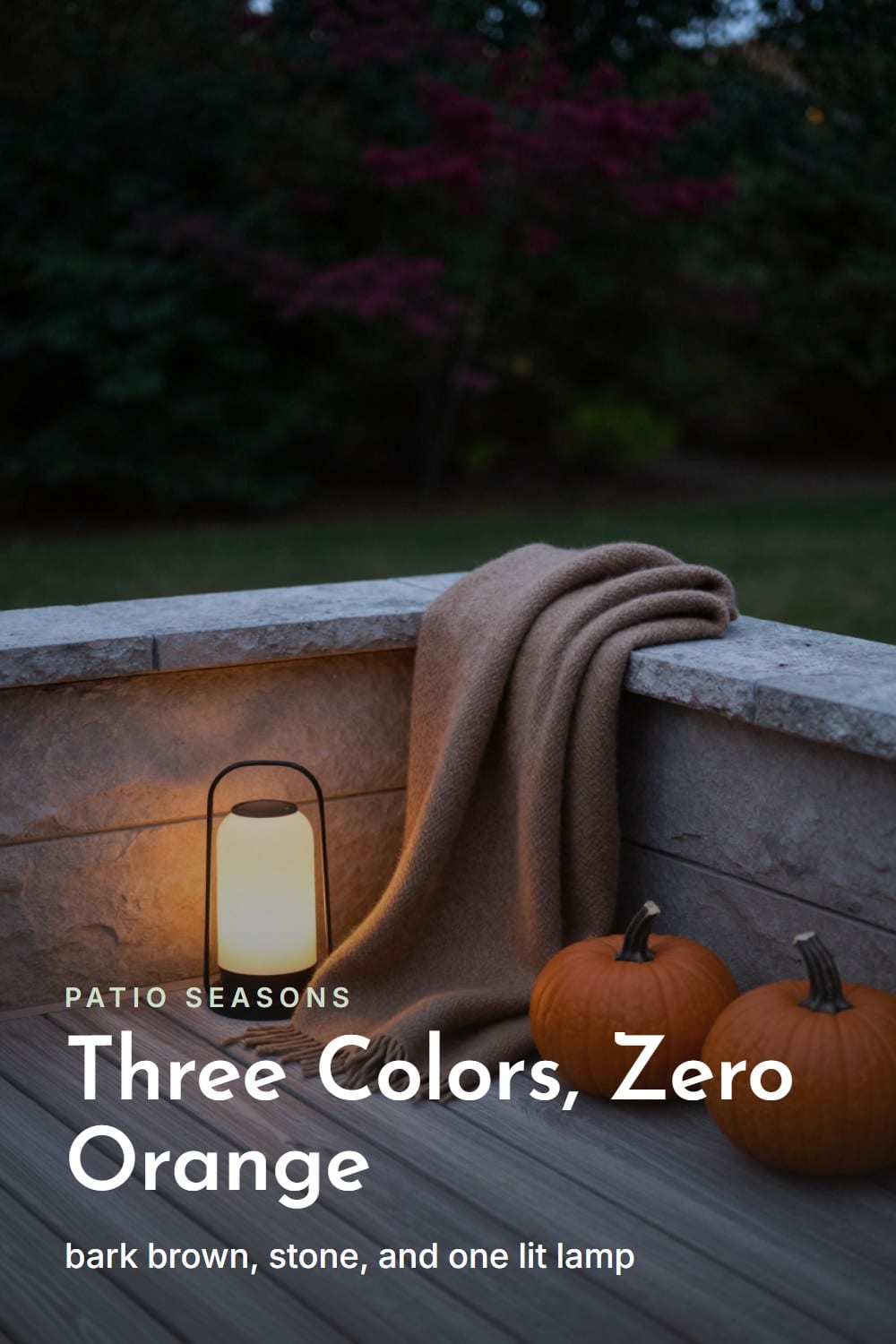
Most of these mistakes come from starting with the seasonal aisle instead of the porch you already have. If you haven't done the structural pass yet -- furniture, planting, and lighting settled before you add a single accent -- transitioning a patio from summer to fall is the piece to read first. And if mums are part of your plan, styling a fall porch with pumpkins and mums covers the one place a little orange is allowed -- staggered planting, not a monochrome wall of it.
Build the Palette in Four Layers
Here's the order that actually works, in practice, on a real porch.
- Anchor neutral first. Silvered teak, weathered stone, or a stone-toned all-weather wicker frame -- something heavy and quiet enough to hold the rest of the palette in place before you add a single accent color.
- One deep hue next. Oxblood or deep olive, landed in one or two spots -- a cushion, a lantern, a glazed pot -- never scattered across the whole space.
- Texture third. Open weave, coarse plaster, real wool, a gritty glaze -- layered over the anchor and around the deep hue until the corner has enough grain to read as autumn on its own.
- One warm accent, last. A single stone-grey or bark-colored gourd, chosen for its texture rather than its color, placed where it actually gets looked at -- not several of them lined up for a photo.
Worth Getting Right Once
One substantial teak bench or table
It becomes the anchor neutral itself, silvering in exactly the direction the whole palette wants to go, and it never needs replacing for color reasons -- only for wear.
A powder-coated steel accent chair in a deep bottle-green or oxblood
Delivers the one deep hue the palette actually needs, ages into more character rather than out of it, and only asks for a yearly look at the welds.
One Warm Accent, Placed Like Punctuation
The warm accent still belongs in the composition -- just one of it, chosen with the same restraint as everything else. A single stone-grey or bark-colored gourd, picked for its texture rather than its color, does more for a patio than a whole cart of the bright orange ones ever will.
Put it where it actually gets seen -- on the one table you sit at, not lined up along a railing nobody stops to look at. A palette this quiet only works if every piece in it has a job. The warm accent's job is to prove the landscape's color made it onto the porch, in exactly one place, on purpose.
The landscape already brought the orange. My job is everything it left out.— Sarah Whitmore
The Quiet Autumn Palette Card
The printable is being finished. It will live here, free, with no sign-up wall.
Frequently asked
What colors should a fall patio use instead of orange?
Is oxblood or deep olive the better single accent color for fall?
Why does my patio look flat in fall photos even though I decorated for the season?
Does powder-coated steel or cast aluminium hold its color better outdoors?
Sarah Whitmore
she keeps the teak, she oils it in spring
Sarah has furnished the same porch three times and finally stopped. She writes about what actually survives a decade outdoors — which wood silvers, which fabric fades, and which inexpensive piece quietly reads the same as the expensive one.
SarahMore from this corner
 Patio Living
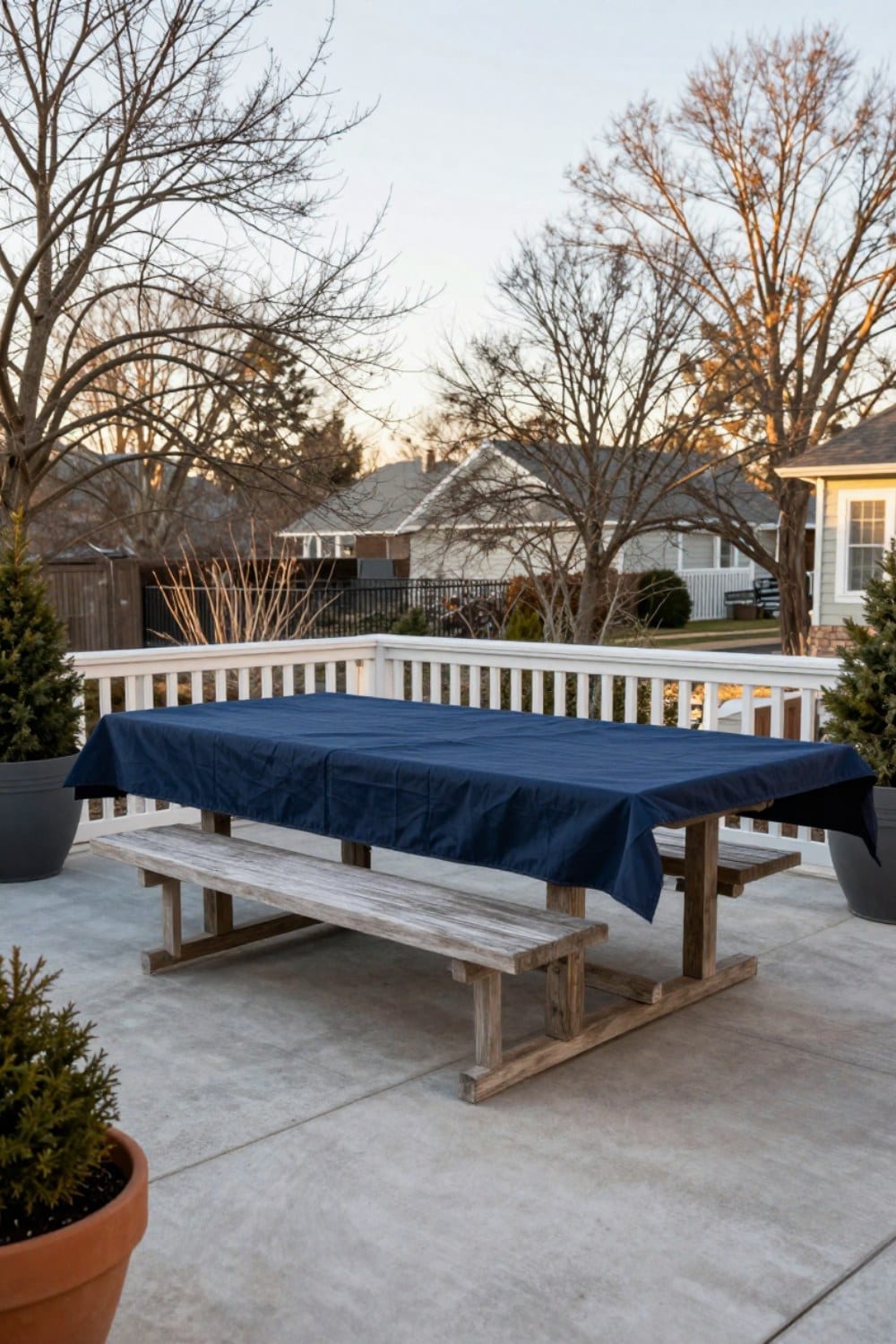
How to Protect Teak Furniture in Winter (What Actually Needs Doing — and What Doesn't)
Teak has a reputation as the fussy, high-maintenance wood on the patio. It's actually the opposite -- one of the only materials built to winter outside without a second thought, as long as you stop treating moisture and cold as the same threat.
Oct 30, 2026 · 10 min read
 Patio Living
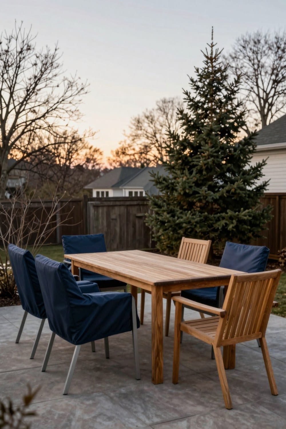
How to Winterize Patio Furniture the Right Way (So It Comes Out Perfect in Spring)
Winterizing patio furniture isn't complicated, but it does ask you to treat every material differently. Here's the material-by-material sequence -- clean, dry, cover or store, elevate -- that keeps teak, aluminium, and wicker looking right through to spring.
Jan 24, 2026 · 11 min read
 Patio Living
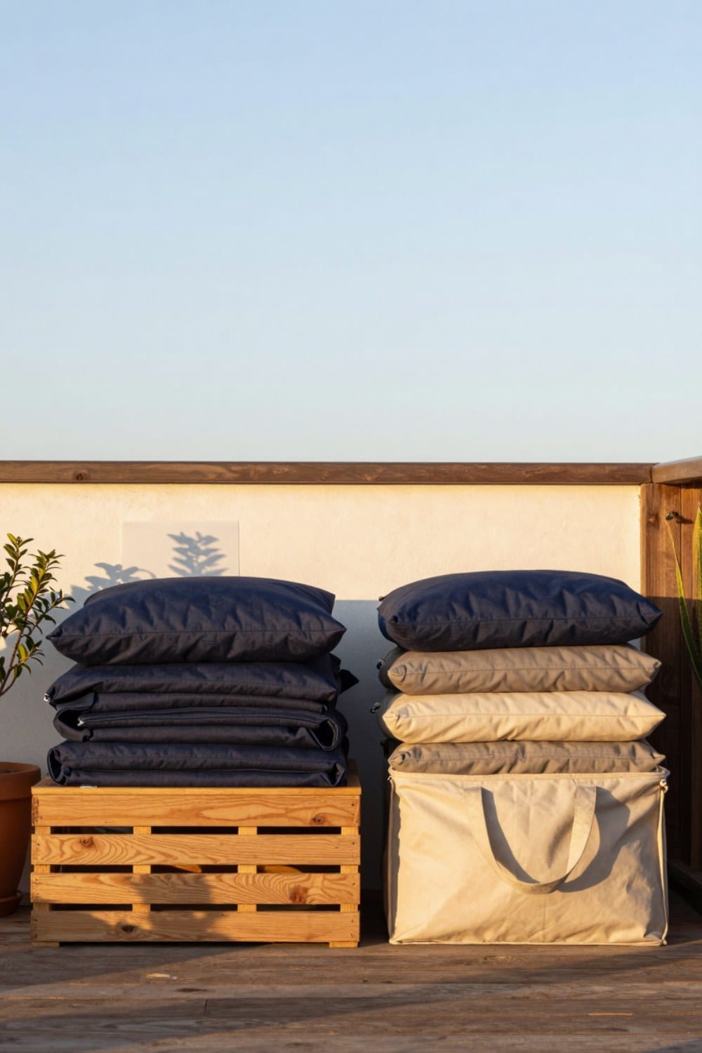
How to Store Outdoor Cushions for Winter So They Come Out Spotless
Mildew doesn't come from cold, it comes from moisture sealed inside the foam. Here's how to dry outdoor cushions completely and store them somewhere breathable, so they come out in spring looking like you just bought them.
Jan 15, 2026 · 9 min read