Sage Green and Terracotta Bedroom: A Warm Palette That Works With Wood
Sage green and terracotta is the easiest earthy palette to live with, as long as you get the proportions, the wood and the lightbulb right. Here is how I split it, where the clay goes, and what to swap each season.

This post contains affiliate links. As an Amazon Associate we earn from qualifying purchases — at no extra cost to you.
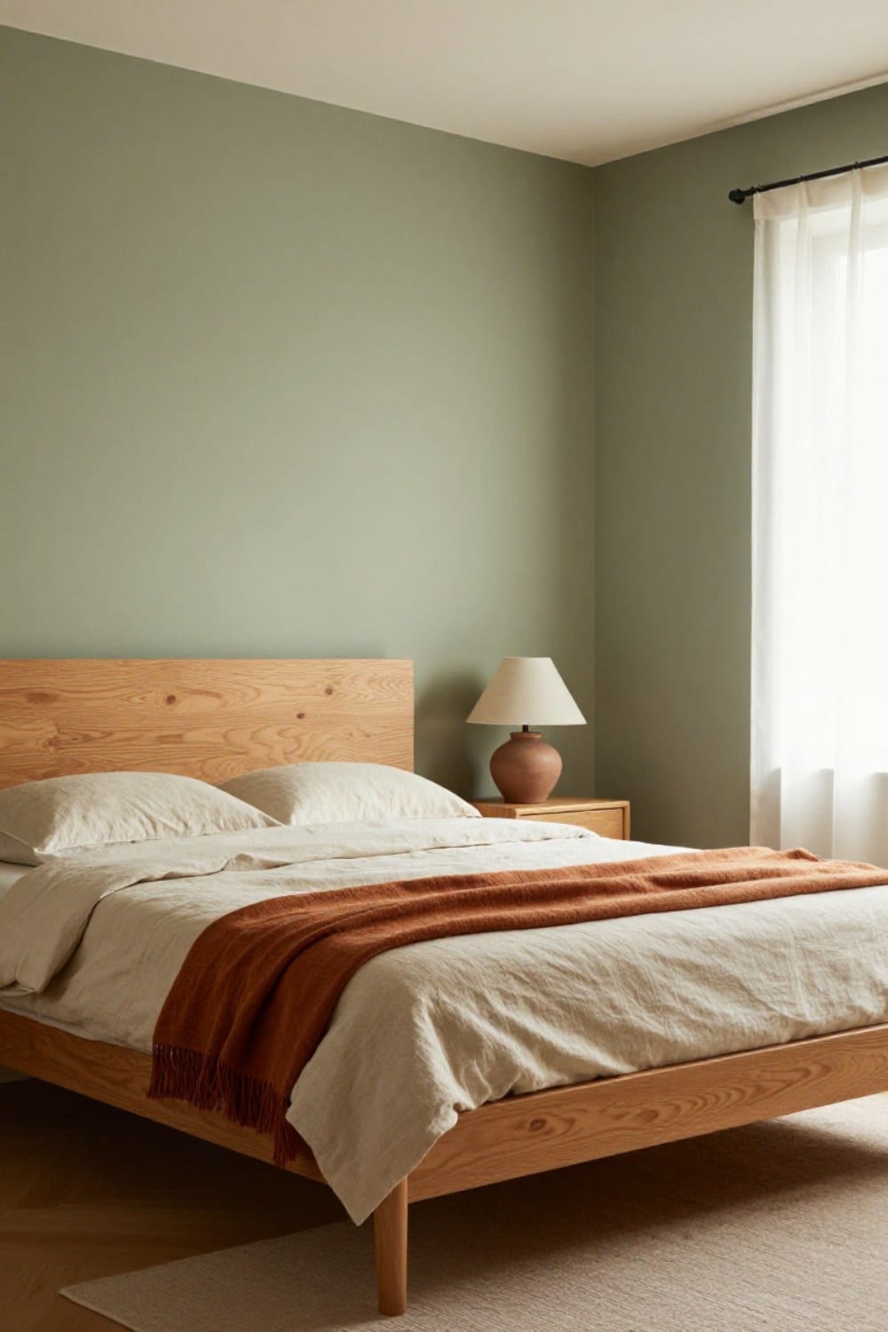
A sage green and terracotta bedroom sounds like a risky pairing until you stand in one at seven in the morning. The green is cool and quiet. The clay is warm and a little dusty. Add a good piece of oak and the room feels like it has been lived in for years, in the best way.
I've had a version of this palette in our guest room for about two and a half years. It began with one lumbar pillow I bought on a whim, and it has survived two paint touch-ups and one truly bad rug decision. So I can tell you where it goes right and where it quietly goes wrong.
If your walls aren't green yet, start with the hub, sage green bedroom ideas for a room that feels calm all year, and come back here when you're ready to warm things up. If they are green already, keep reading.
Why a sage green and terracotta bedroom feels so settled
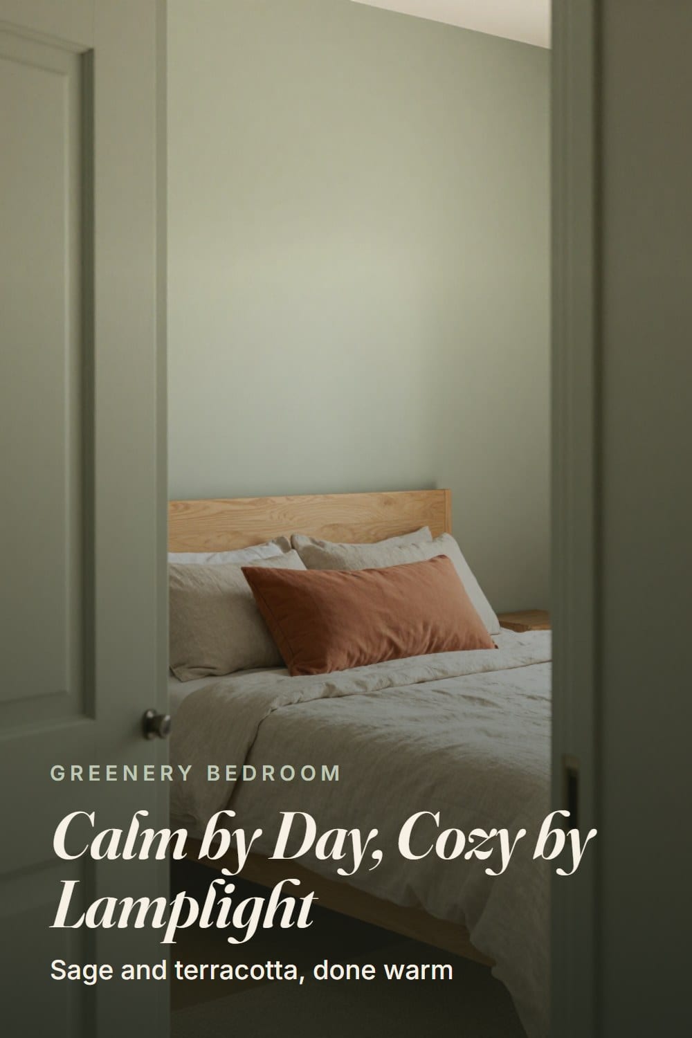
Both colors have gray in them. That's the whole secret. A true kelly green beside a true brick red looks like a school mascot. Soften both and you get something closer to a dried herb sitting next to a flowerpot.
Green and red-orange sit roughly across from each other on the color wheel, which is why they feel balanced instead of matchy. Sage does the calming. Terracotta does the warming. Neither has to work hard.
The timing helps, too. Pinterest's 2026 palette moves away from muted minimalism and toward nature greens, and jade got named as the softer-than-emerald, richer-than-sage option. Sage is the quieter cousin of that shift, and terracotta keeps it from going flat. If you want the deeper version, jade green bedroom ideas is the next stop.
One thing to check before anything else is undertone. A warm gray-green plays nicely with clay. A blue-leaning green goes icy beside it, and the terracotta starts to look orange and loud. If you're still choosing, the sage green paint roundup shows the options in real light, and that's where the names live.
The 60 30 10 split, applied to a real bedroom
The classic rule is 60 percent main color, 30 percent secondary and 10 percent accent. For this palette that means roughly 60 sage, 30 warm neutral and 10 terracotta.
The 60 doesn't have to be the walls. In our guest room it is, because I painted all four. But I've seen it work with warm white walls and the sage carried by the duvet, the curtains and a painted dresser. If you only want to paint one wall, the accent wall guide covers paint, limewash, panelling and wallpaper.
In a 12 by 13 foot room, the 10 percent is smaller than you'd think. A lumbar pillow, a lamp base, a folded throw, a stripe in the rug. That's about it.
My first attempt ran closer to 25 percent, because I fell for a rust velvet headboard. The room looked like a sunset at a gas station. I sold the headboard that spring.
Here's a quick test. Stand in the doorway and squint. The terracotta should show up as a few warm spots spread around the room so your eye travels. If it pools in one corner, move a piece to the other side.
The wood is what holds the two colors together
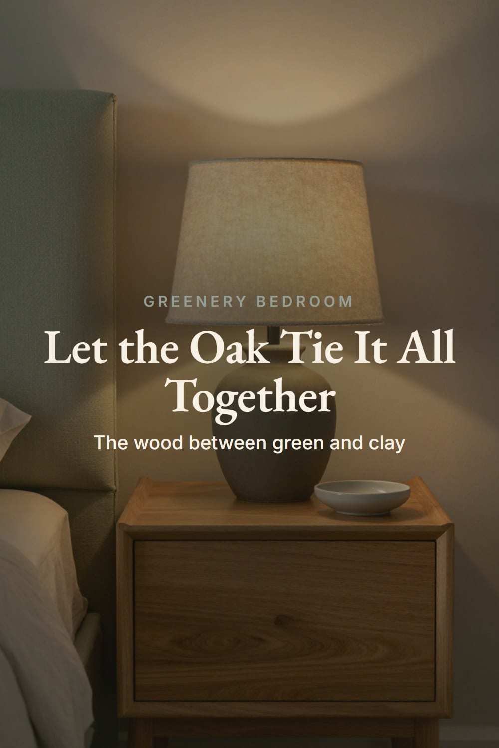
Sage and terracotta are two voices. Wood is the third, and it's the one that makes it sound like a chord. Oak, a teak-toned finish or walnut already carries orange-brown, so it sits between the green and the clay like a translator.
Honey to mid-tone oak is the easiest. Walnut is richer and suits a lighter sage, since dark wood against dark green gets heavy. A teak-toned piece lands somewhere in the middle. Gray-washed or very pale ash is the one to watch: it's cool, and it makes the clay look like a mistake.
If your bed frame is painted or upholstered, bring the wood in elsewhere. Nightstands, a 36 inch bench at the foot of the bed, picture frames, the top of a dresser. Two wood tones are fine if they share the same warmth.
One snag. Very orange builder-grade oak can swallow terracotta whole. If your floors are that honey-orange, lean toward a clay with more brown in it, or a rust that has gone a little pink, so it reads as its own color.
Where the terracotta actually goes
Ten percent means small, repeated and spaced out. These are the four places I'd start, in order of how much they change the room.
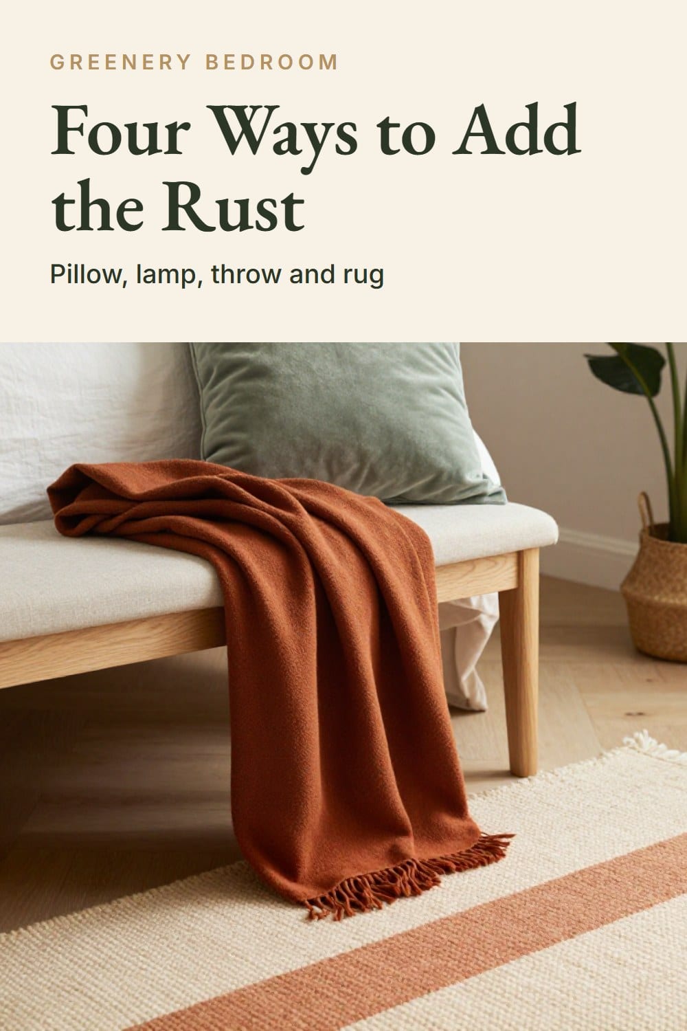
- A lumbar pillow. 12 by 20 inches, in rust cotton velvet or washed linen, leaning against the sleeping pillows. It's the easiest first move and the least risky.
- A clay lamp. A matte terracotta or speckled clay base with an oatmeal linen shade and a 2700K bulb. It glows at night and sits quietly by day.
- A rust throw. Wool or a linen blend, folded in thirds across the foot of the bed. It's the piece you'll swap most often.
- A rug with clay in it. A cream flat-weave with a clay stripe, 8 by 10 under a queen bed, so the floor supports the room without shouting.
Buy the pillow first. You can live with one pillow for a week before you decide about a lamp, and if the color looks wrong at 9 p.m. you can tuck it in a closet. Mine looked a shade too orange for the first few days, then the room settled around it. That's the usual pattern, and it's why I never add two clay pieces in the same weekend.
Smaller pieces count, too. A ceramic dish on the nightstand, a vase of dried grasses on the dresser, a clay pot in the corner.
Put a plant in that pot if you like looking at one. Just don't expect it to clean your air. The famous NASA study ran in a sealed chamber, and a 2019 Drexel review found you'd need roughly 100 to 1,000 plants per square meter to match ordinary ventilation. Plants are for looks and routine.
What to keep neutral
The 30 percent is where your eyes rest. Think oatmeal, warm white and soft stone, all in natural fibers. A stone-washed linen duvet cover, 300-thread-count cotton percale sheets, and natural linen curtains hung high near the ceiling and long to the floor.
Skip bright blue-white and cool gray. Pure white next to clay looks stark, and gray drains both colors at once. A creamy warm white keeps everything soft. If you'd rather go crisper, green and white bedroom ideas takes that road.
Walls that aren't sage deserve a thought, too. If the other three are a warm white, the green wall behind the bed can feel like a stage set. Carry a little of it across the room: a sage linen pillow cover on the reading chair, a frame mat in the same soft green, a painted dresser. The eye needs to find the green twice.
Art can stay quiet. Black-and-white photographs in thin oak frames, or a single large botanical print, keep the wall from competing with the bed. I tried a terracotta-heavy abstract once. It was lovely on its own and far too much beside the lamp.
Metal should be warm as well. Aged brass on a lamp or drawer pulls repeats the gold in the oak. Matte black works in one spot, like a curtain rod. Polished chrome is the one I'd leave out.
How the room changes from morning to lamplight
This is the part photos hide. A north-facing room pushes sage toward blue-gray in the morning and cools the clay. A south-facing one warms both. Neither is a problem, but it helps to know which one you have.
West light is the sneaky one. Around five in the afternoon it turns everything amber, and a rust throw that looked muted at breakfast suddenly looks like it's lit from inside. I like that hour best in our room. If you don't, a sheer linen curtain softens it.
At night everything flips. Under a 2700K bulb the terracotta glows and the sage deepens toward olive. A 4000K bulb does the opposite: it flattens the clay and makes the green look clinical. So the bulb matters as much as the paint. If your sage drifts olive after dark and you like it, olive green bedroom ideas is worth a look.
Before you commit, tape a big paint sample or a swatch of your duvet fabric to the wall and look at it at 7 a.m., noon and 9 p.m. for three days. It's boring. It also saves a Saturday of repainting.
Swapping the 10 percent from summer to winter
The nice thing about 60 30 10 is that 90 percent of the room never moves. Only the accent changes. In summer I swap the rust velvet for a washed-out peachy clay linen cover and put the wool throw in a bin. The bed gets lighter.
Come November, the velvet and the wool throw come back, and I move the clay dish to the nightstand where the lamp light hits it. Same walls, same lamp, same oak. A different room.
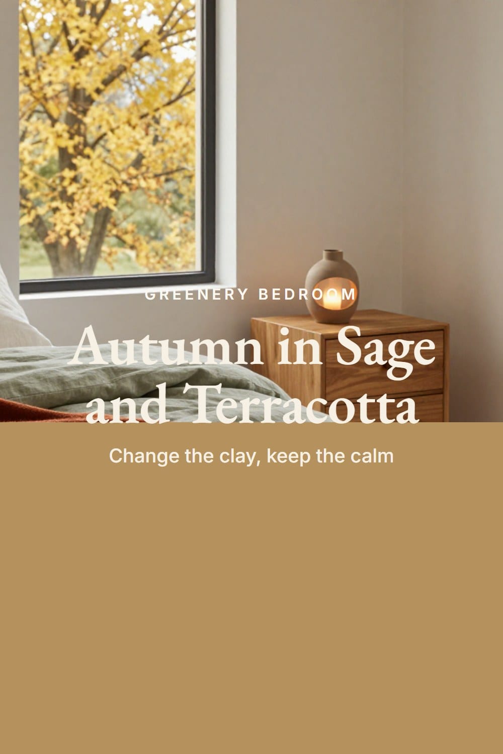
Spring and early fall are just a dial. Lighter clay and fewer layers when it's warm. Deeper clay and heavier fabric when it isn't.
Why it goes muddy, and the fix
When this palette fails, it looks muddy. Dull, a bit brown, a bit tired. It's nearly always one of these.
- Everything sits at the same lightness. Add a clean cream and one deeper note, like a walnut tray.
- The sage has a gray-brown undertone and meets a brown-leaning clay. Change one of the two.
- The terracotta is bunched in one spot. Spread it across the room.
- The bulbs are cool. Switch to 2700K.
- Every textile is patterned. Keep one pattern and let the rest be plain.
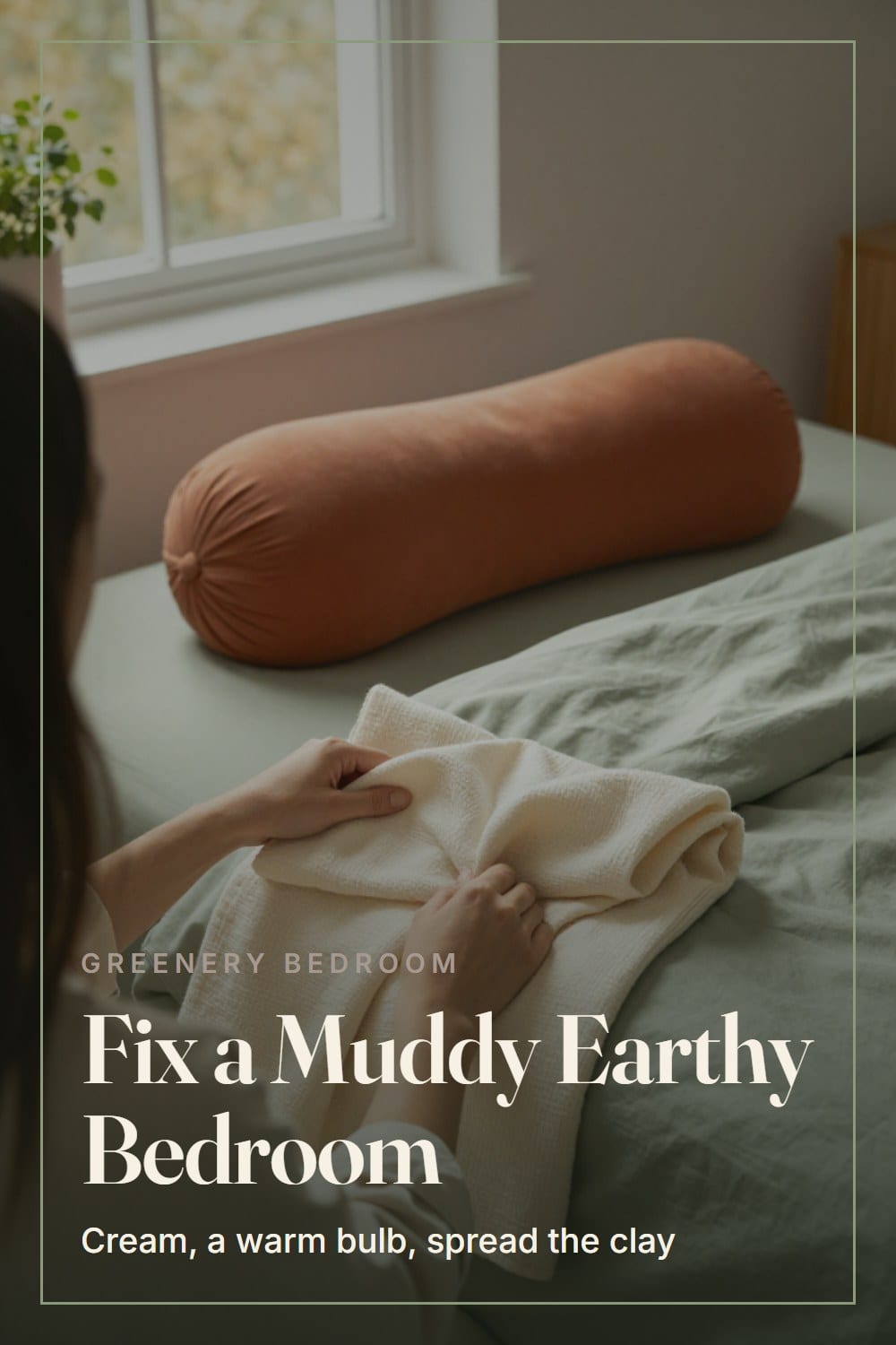
That's the palette. Start with the pillow.
If you are building the 60 30 10 split from this post, these three cover the sage, the clay and the warm texture. Start with whichever one your room is missing.
Sage green linen grommet blackout curtains, 84 in
Sage on the window wallSage green linen curtains with grommet tops and a blackout lining, 84 inches long.
Terracotta ceramic jar table lamps, set of 2
Clay color in small dosesA pair of ceramic jar lamps in terracotta, which puts the clay at lamp height and suits a warm bulb.
Burnt orange waffle knit throw, 50 x 60 in
The warm layer on the bedA waffle-knit throw in burnt orange, 50 by 60 inches, that adds texture and a deeper clay tone at the foot of the bed.
The Green Bedroom Color Planner
The printable is being finished. It will live here, free, with no sign-up wall.
Frequently asked
Does terracotta go with sage green?
What wood goes best in a sage green and terracotta bedroom?
Can I do this palette with white walls?
How many terracotta pieces are enough?
Sarah Whitmore
she keeps the teak, she oils it in spring
Sarah has furnished the same porch three times and finally stopped. She writes about what actually survives a decade outdoors — which wood silvers, which fabric fades, and which inexpensive piece quietly reads the same as the expensive one.
SarahTimeless Manor is a participant in the Amazon Services LLC Associates Program, an affiliate advertising program designed to provide a means for sites to earn advertising fees by advertising and linking to Amazon.com. As an Amazon Associate we earn from qualifying purchases. This means if you click a link and buy something, we may receive a small commission at no additional cost to you. We recommend pieces we believe will still be on your patio in a decade — never on commission.
More from this corner
 Bedroom Sanctuary
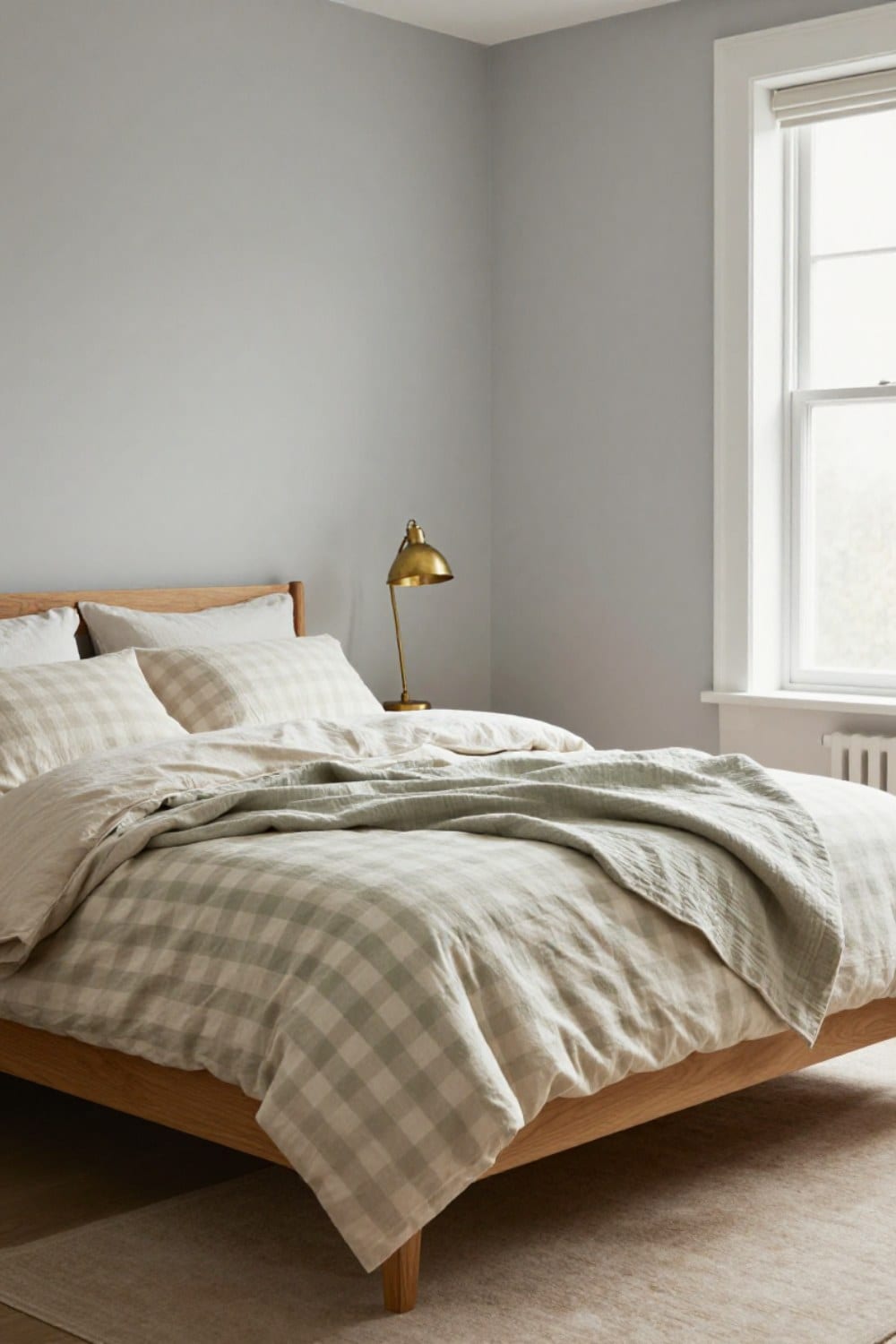
Green Gingham Bedding: How to Style It So It Looks Grown-Up
Green gingham bedding can look calm and collected instead of nursery. Here is how to choose the check size, keep it to one layer, mix it with other patterns and pair it with wood so the bed looks grown-up.
Oct 25, 2026 · 10 min read
 Bedroom Sanctuary
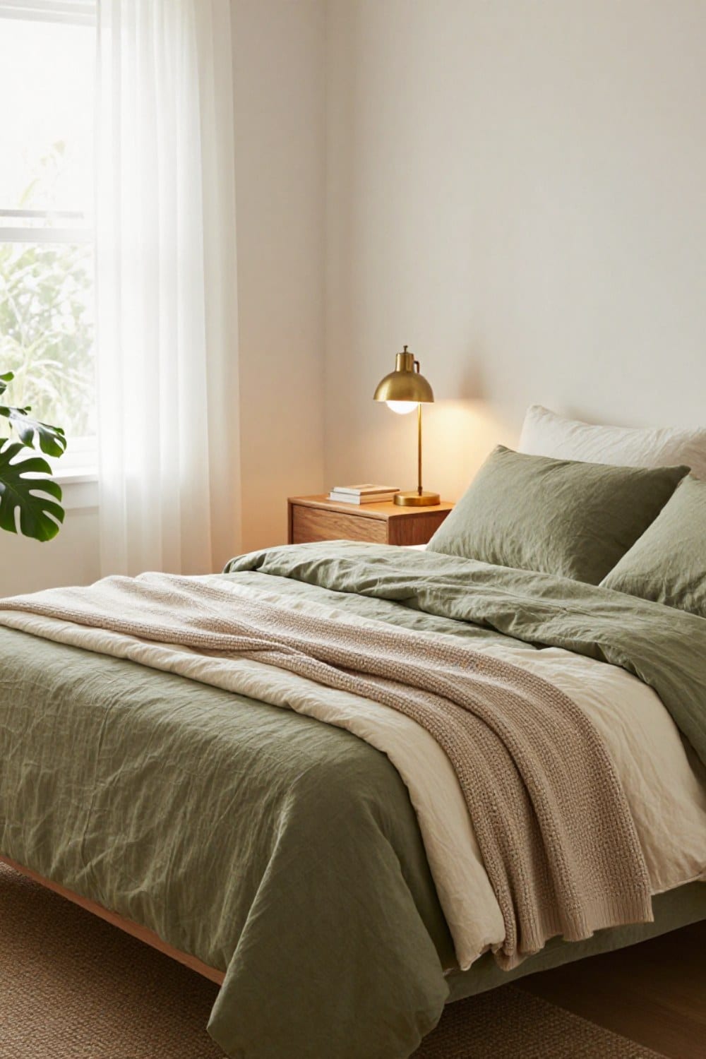
Olive Green Bedding Ideas: How to Make a Green Bed Look Collected
Olive green bedding ideas that make a bed look collected instead of matched: the three-tone rule, the fabrics that read expensive in green, what goes on top, and what belongs on the walls behind it.
Oct 22, 2026 · 11 min read
 Bedroom Sanctuary
What Color Walls Go With Green Bedding? Six Pairings That Work
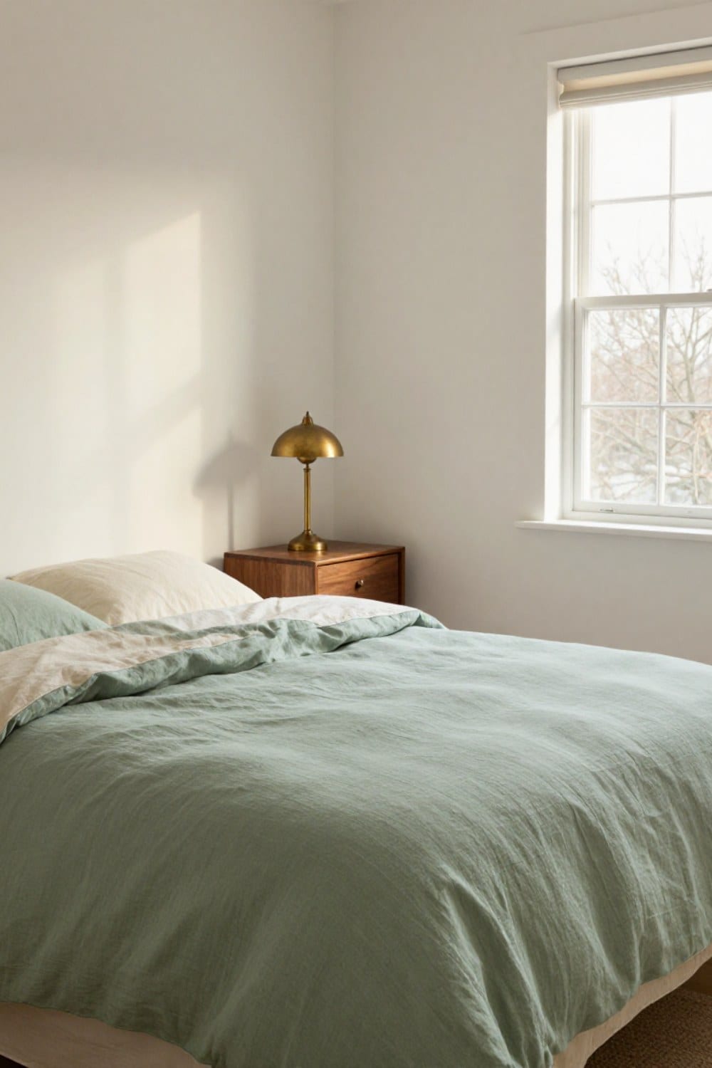
Six wall colors that make green bedding look chosen on purpose: warm white, greige, soft plaster pink, taupe, pale sage and deep chocolate or charcoal. Each one comes with the green it suits, how your light changes it, and the wood that ties it together.
Oct 20, 2026 · 11 min read